


Another cut-out serial animation I worked on, serving as both Character Designer and Graphics Supervisor.
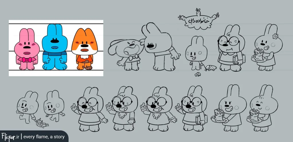
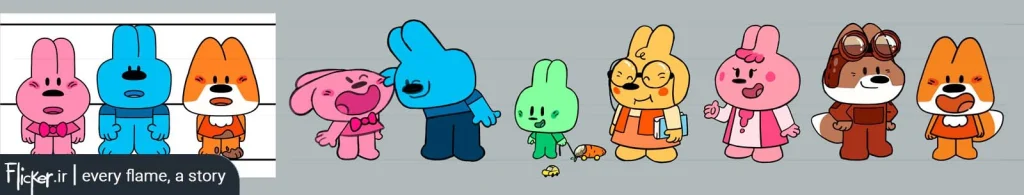
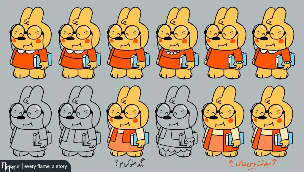
This project presented a highly minimalist style whose rules I hadn’t established. The director had designed the three initial characters, which were already client-approved. My task was to organize the style’s simplifying principles to maintain the established graphic world in subsequent character designs – an interesting challenge
My first attempt at structuring the style wasn’t successful. After reviewing it, the director insisted on:
- Keeping all characters short
- A chubby, rounded design language (literally: ‘everything should be plump and doll-like’)
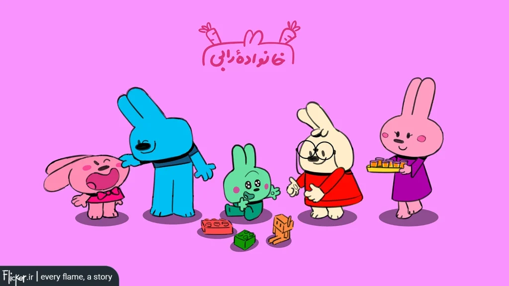
Through this trial-and-error process, I mastered the style’s core principles and expanded the character roster
Through careful research and style development, the constraints I implemented left me primarily working with:
- Strategic color choices to express personalities and ages
- Proportion manipulation to convey emotions and characteristics
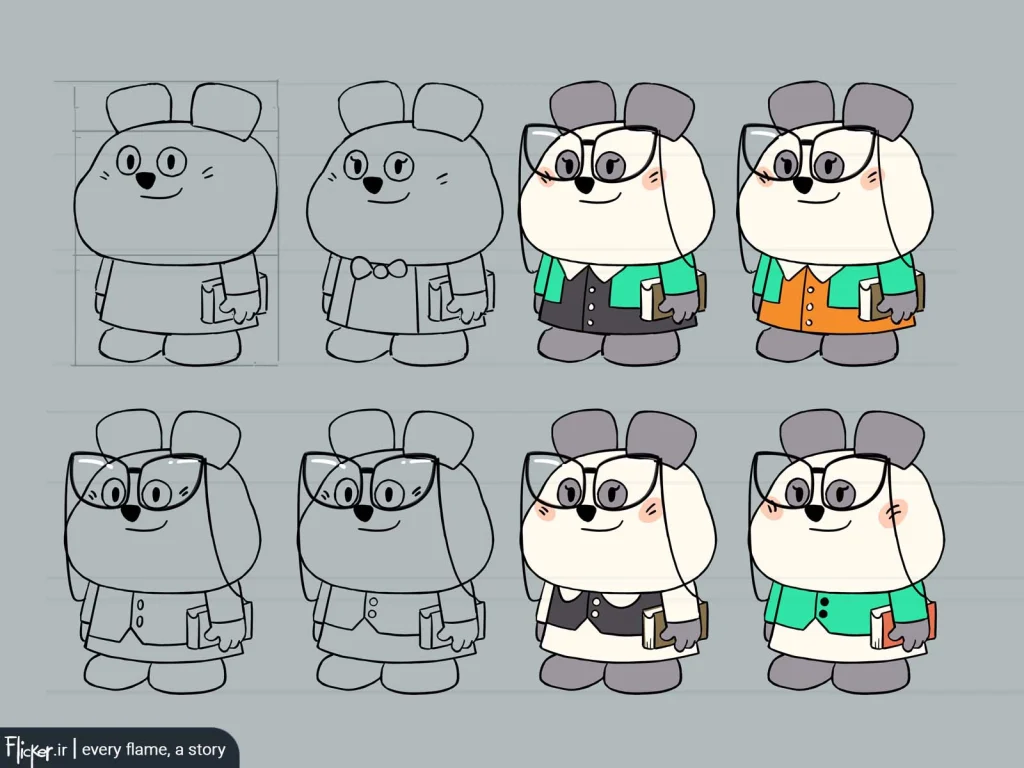

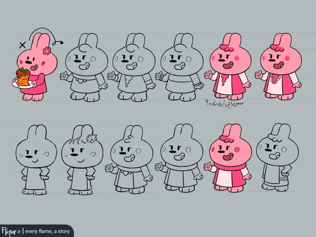
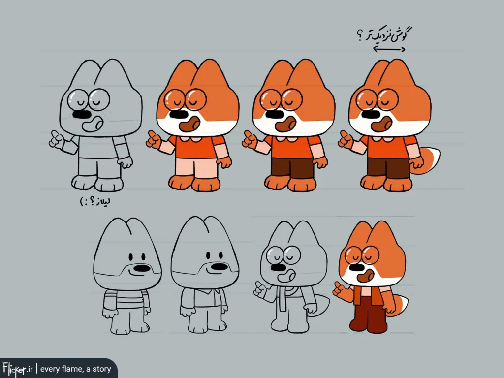
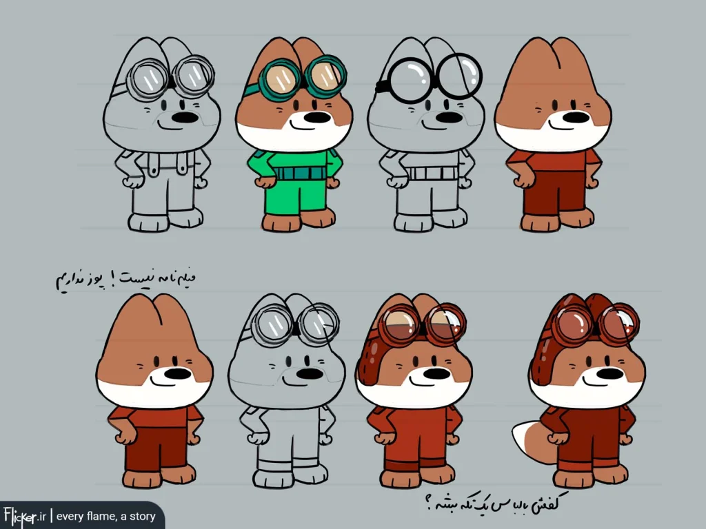
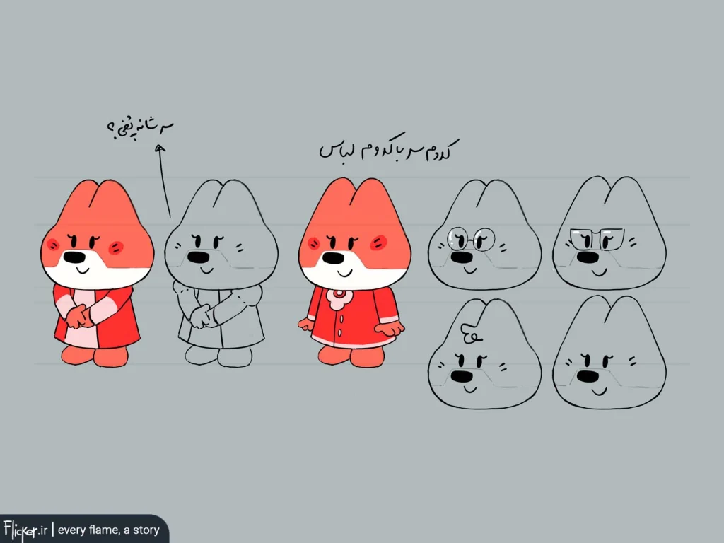
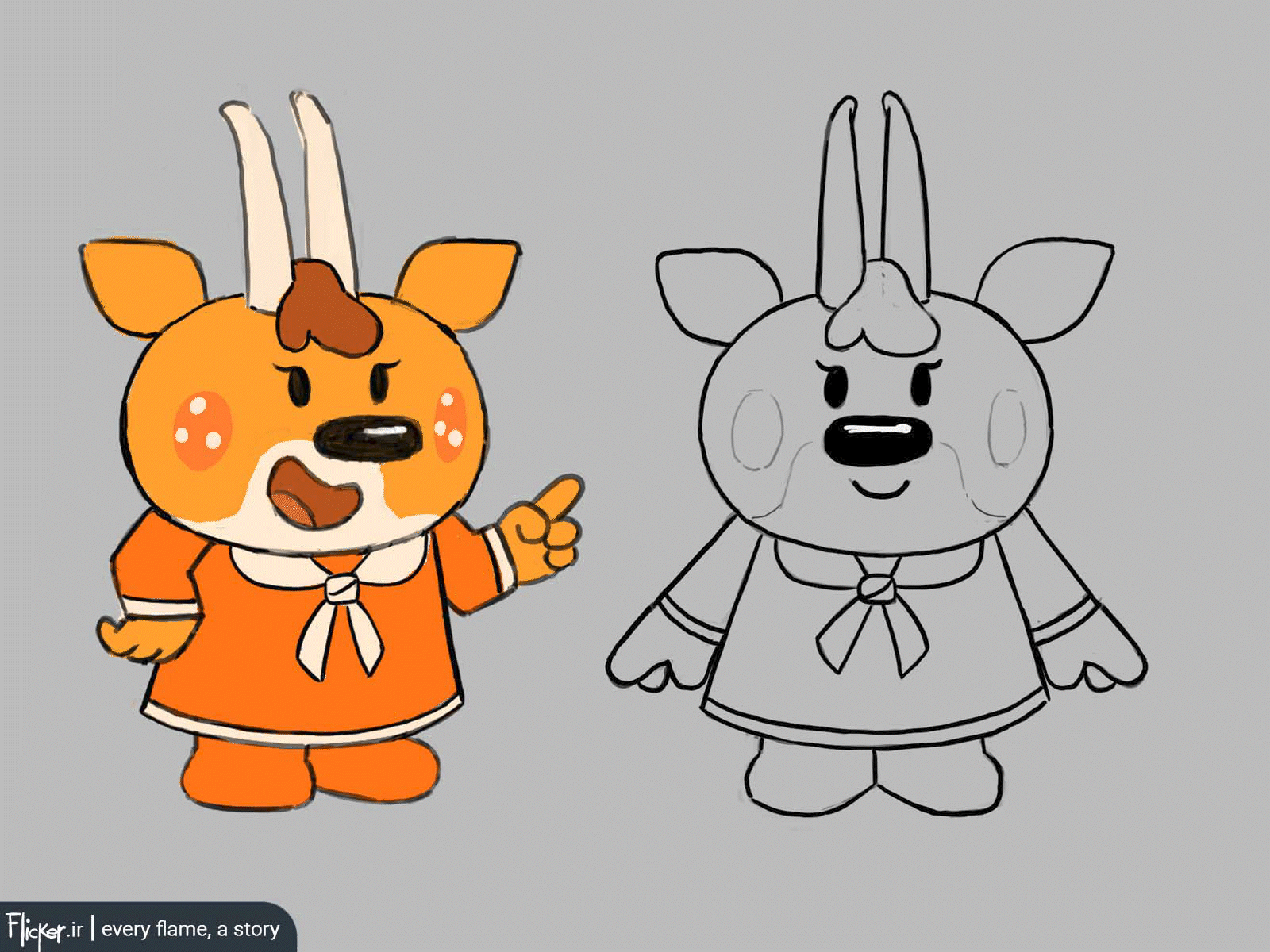
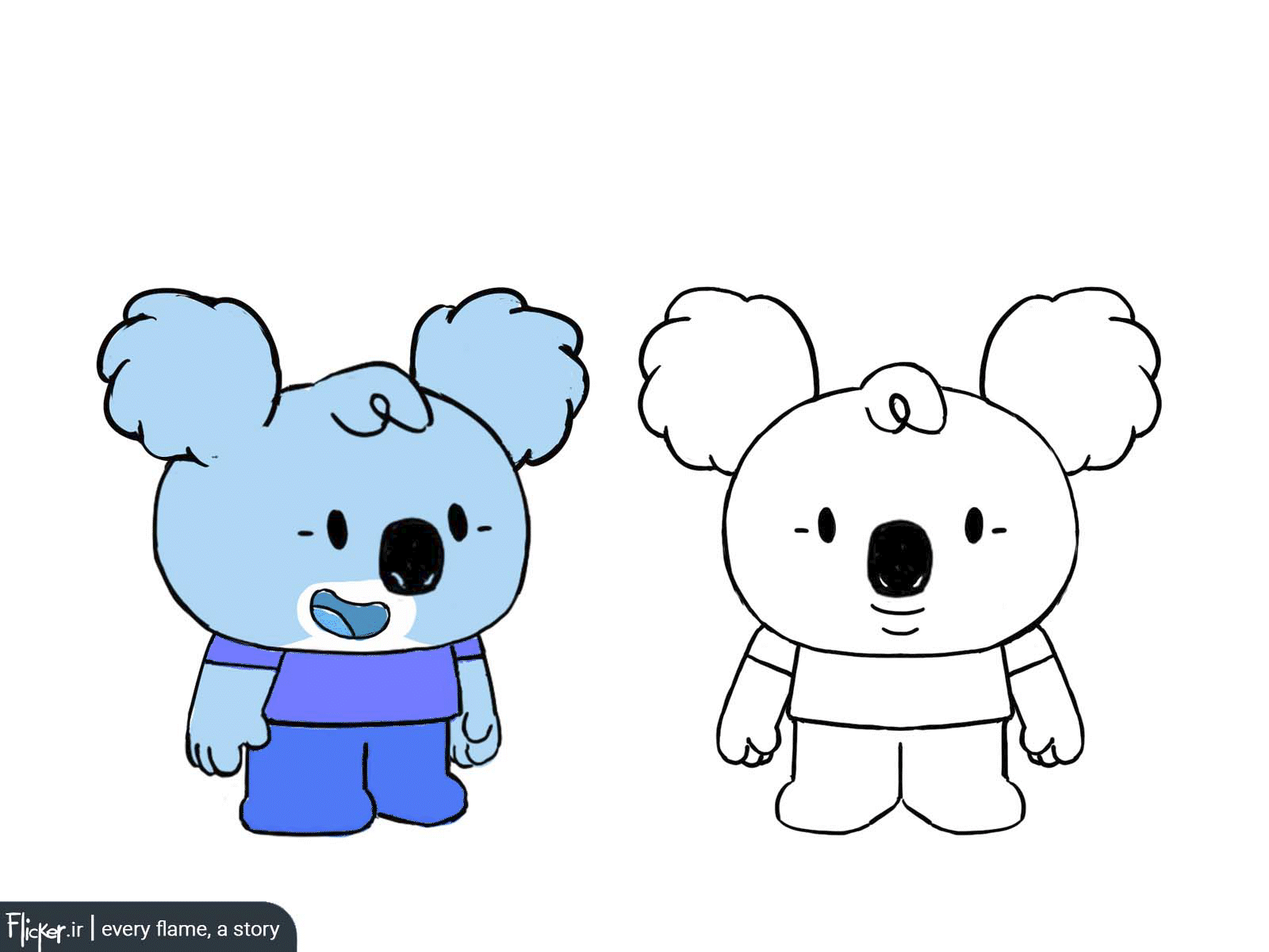
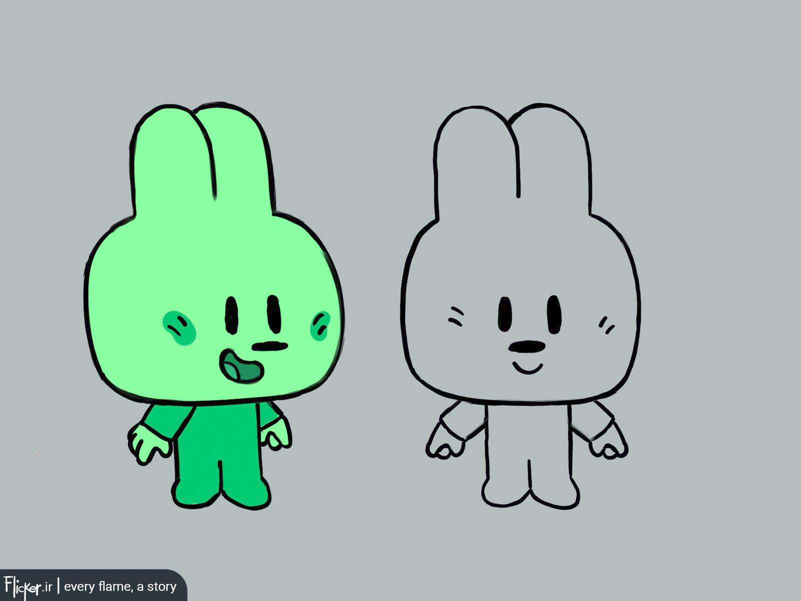
The next step involved ensuring all characters could rotate smoothly and preparing finalized character sheets for production.
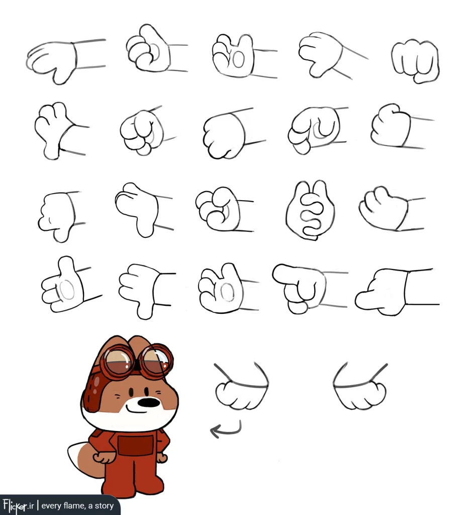
I designed multiple hand variations compatible with the chubby style for rigging switches:
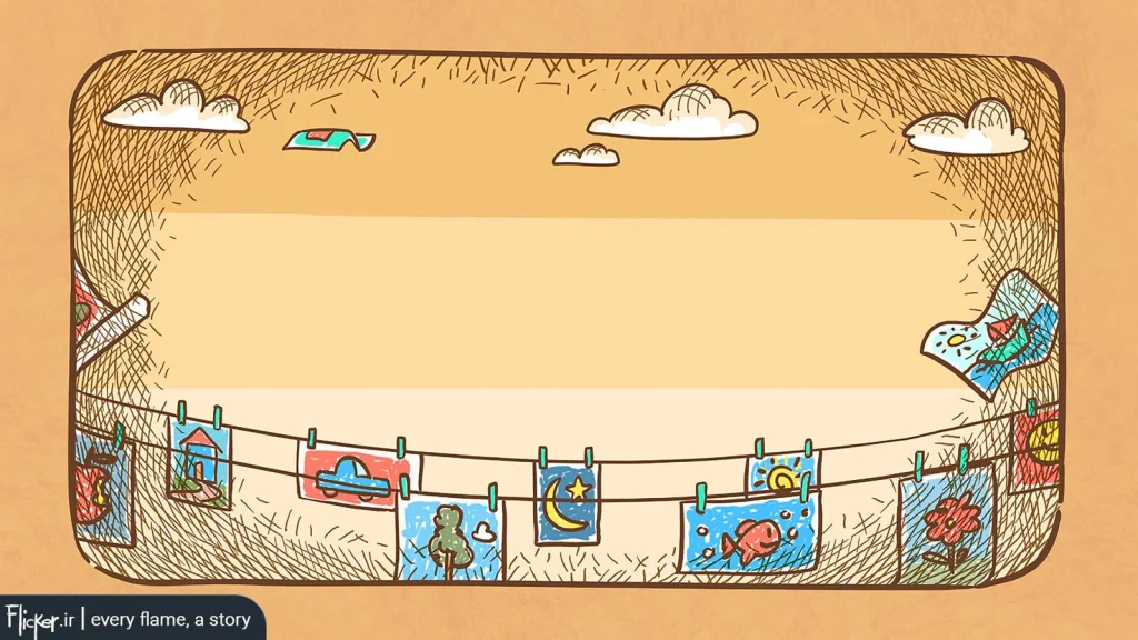
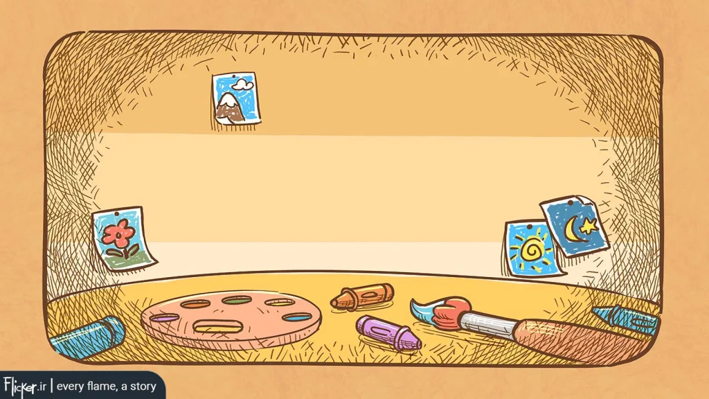
Finally, I designed minimalistic backgrounds for the end credits, featuring ample negative space to accommodate the crew members’ names.
As Graphics Supervisor, my job was to guide the object design team in maintaining the style and correct designs. Many team members were interns, but I never saw myself as a ‘teacher’ or them as ‘students’ – I always feel like a student myself who still has much to learn. Still, I had to create a clear workflow so the team could get results with minimal back-and-forth – avoiding both frustration from too many edits and production delays.”
Solutions I tried:
- To prevent rework:
- Had team members show me sketches for approval before full execution/coloring
- This let us improve designs together before finalizing, minimizing wasted work
- Background rules:
- For objects on backgrounds (which unlike characters had no strokes), the only way to distinguish objects was through color and B&W contrast. Consequently, we enforced designing objects directly on their scene backgrounds – white-background submissions were invalid for review.
- Team management challenge:
- Had to balance feedback carefully – not so harsh it demoralized them, not so lenient it reduced their work quality
- Not sure how successful I was – would need their feedback
I’ll message them after writing this to get their feedback.
Personal Note
While designing these objects, the studio requested two investor-pitch screenplays from me – projects I found highly engaging and important. Parallel work felt bittersweet since I wished to dedicate all my time to writing, but couldn’t refuse the studio’s needs.
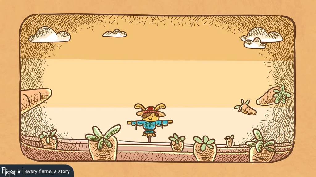
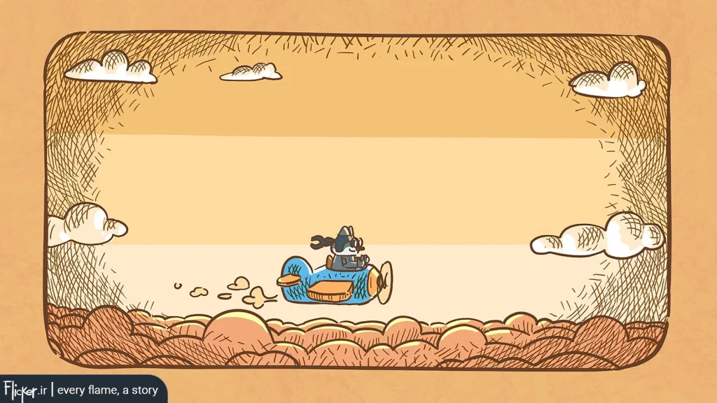
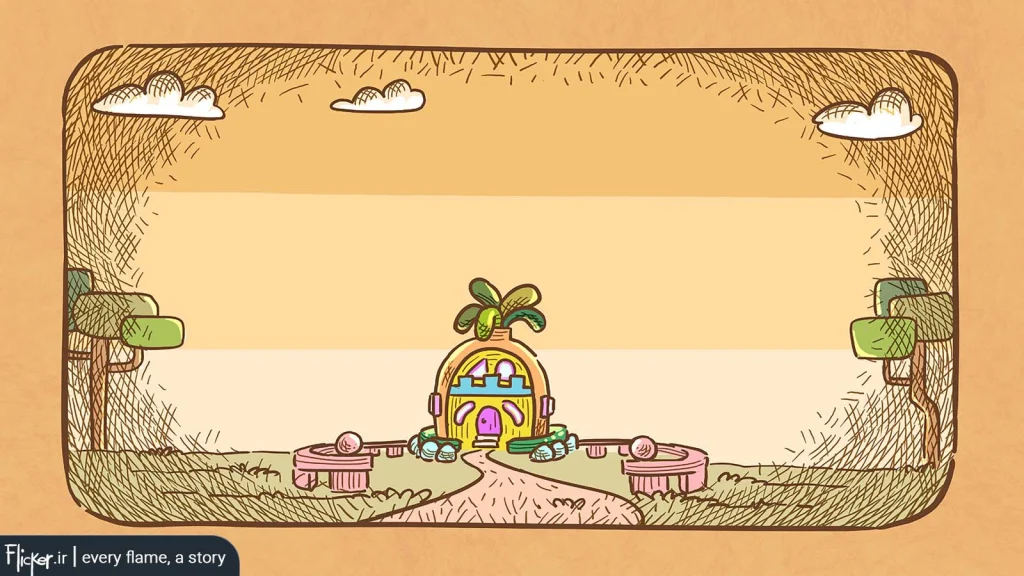
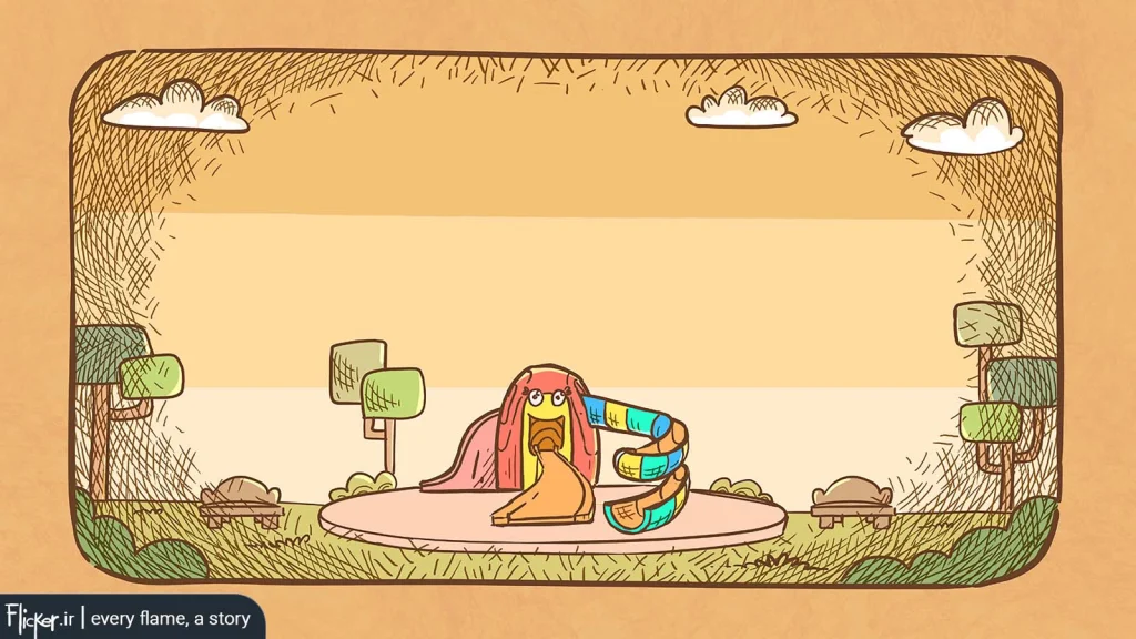
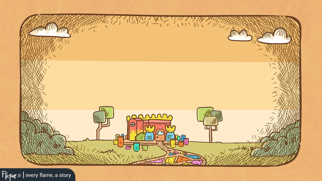
Some of the objects I designed for this project:
Honestly, while working on these assets, the studio asked me to prepare two screenplays for investor pitches—projects I found truly exciting and meaningful. It felt bittersweet to design these objects in parallel when I desperately wanted to dedicate all my time to writing and developing those film ideas. But of course, I couldn’t say no to the studio’s needs.
Feel free to share any questions or thoughts – I’m happy to discuss further.